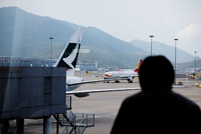
Voted "World's Best Airport" just this year by the annual Skytrax Aviation awards, the Hong Kong International Airport designed by famed British architect Sir Norman Foster, this is one of the world's most expensive and largest airports to have been ever built on reclaimed land. Characterized by the open, airy ceilings and high archs, it is a big, expansive and white shiny monolith, designed to be both slightly intimidating and giving the air of effortless efficiency.
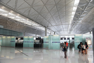
In short, this airport wants you to get out of it as soon as possible, which is designed to be just that. Big, white, shiny with metal and glass and endless moving walkways, everything is designed to be as functional and efficient as possible to facilitate your transit from point A to point B. You can't help but feel that there's this sense of purpose and function for everything - this is one serious airport, and it means business.
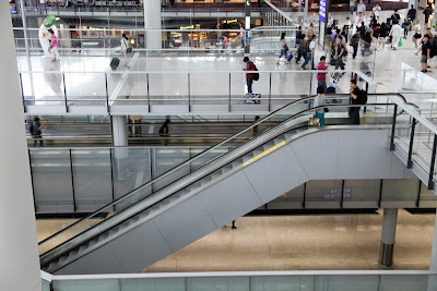
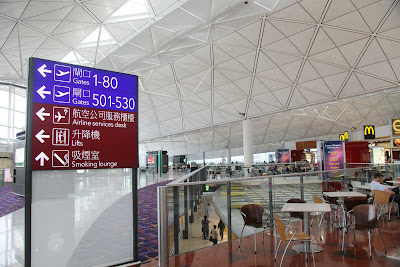
Every single sign is big and clear and screams information to you in your face in a fuss-free utilitarian manner. The terminal is light, well-ventilated and comfortable throughout in terms of temperature. Announcements are belted out with a clear booming echo to ensure every inch of the terminal hears it. Maximum clarity, maximal function.
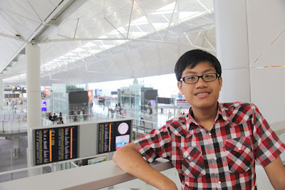
There you have it. The good points. Its a seriously good airport because it fundamentally does what it does - as a terminal and place for transit.
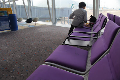
However, that does have some shortfalls. The seats are horribly stained with mysterious liquids and smell stale, with litter occasionally landing on the tables. The above photo is a prime example.
There's not a single attempt at landscaping in sight. No greens, only soul-less white and grey, paled on with chunks of hard warm wood at the nearby food outlets. This is an airport that has no soul, no human element, and does not even attempt to be inviting or accommodating in any sense in terms of design. It is a stolid, massive terminal design to fulfil its primary function.
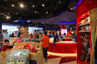
Okay, I mean there IS A DISNEYLAND store (as the whole HK seems to be fascinated about) but that's about it. Yeah. A sad, color laden store full of over-priced gifts and mickey mouse knick knacks that you don't really need.
This airport has about as much soul as a robot in a porn movie. There's no attempt for it to welcome anyone besides a obligatory "Welcome to HKIA" banners and signs placed here and there. The staff are nice and polite, but that's about it. When travelling through this place, there is nothing that hints or pampers you with the warm romance of travel, that excites you and energizes you at the wondrous potential of your intended destination. That's why my number one airport will always go to Changi. Call me biased, or whatever, but I really do think that the Airport of The Year award should have gone to us.
Because, as they say, the feeling is first class. :)


0 comments:
Post a Comment
Note: Only a member of this blog may post a comment.